
Brief Overview↪ We’ve discussed the growing importance of mobile-first design for WooCommerce stores, especially as mobile commerce continues to rise in 2025. We explained what a mobile-first WooCommerce theme is and how it differs from traditional responsive design, emphasizing its benefits, including improved mobile user experience, better SEO rankings due to Google’s mobile-first indexing, faster load times, and higher conversion rates.
The rise of mobile commerce is impossible to ignore. With over 60% of online purchases made from smartphones in 2024, and that number steadily increasing, ensuring a seamless shopping experience on mobile is no longer a luxury; it’s a necessity.
If you’re running a WooCommerce-powered online store, your theme plays a huge role in how your site performs across devices.
A mobile-first WooCommerce theme ensures your eCommerce website is built primarily for smartphones and small screens, then scaled up for tablets and desktops.
This method leads to faster load times, better user experiences, and higher conversions.
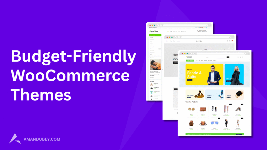
In this post, we’ll break down what mobile-first WooCommerce themes are, why they matter, and showcase six of the best options for 2025, including both free and premium picks like Shop Mania, Shoptimizer, and WoodMart.
What is a Mobile-First WooCommerce Theme?
A Mobile-First WooCommerce Theme is a WordPress theme specifically designed with mobile users as the top priority.
Instead of starting with the desktop layout and adapting it for smaller screens (which is called “responsive design”), a mobile-first theme begins with the mobile layout and then scales up for tablets and desktops.
Google uses mobile-first indexing, meaning it evaluates the mobile version of your site first when ranking pages.
Mobile-first themes are usually lighter and load quicker, which reduces bounce rates and increases conversions.
Benefits of a Mobile-First Theme:
- Improved Mobile UX: Better navigation, larger buttons, responsive menus, and fast load times.
- SEO Advantage: Google now indexes mobile versions first (Mobile-First Indexing).
- Lower Bounce Rates: Faster pages mean users are more likely to stick around.
- Increased Conversions: Mobile users can quickly browse and check out.
- Easy Navigation: On mobile not everything can be seen on small screen, so theme has to to be responsive.
Key Features to Look for in Mobile-First WooCommerce Themes
Not all WooCommerce themes are created equal. Every theme has its own uniqueness and features.
Here are the must-have features of a strong mobile-first design:
- 100% Responsive Layout
- Speed Optimized
- SEO Ready
- Customization Options
- Plugin Compatibility
- Touch-Friendly UI
- Mobile Menus
Top Mobile-First WooCommerce Themes in 2025
Let’s take a deeper look at the six top-performing themes optimized for mobile shopping.
1. Shop Mania (Free + Pro)

Developer: ThemeHunk
Best for: Multipurpose WooCommerce stores
Shop Mania is a lightning-fast, fully responsive WooCommerce theme designed with mobile-first architecture.
It offers multiple pre-built starter templates for fashion, electronics, furniture, and more.
It has more then 60+ pre build demo websites. It has many more features like fast checkout and multiple header footer layouts.
Key Features:
- 60+ Pre build demo sites
- Ajax Live Product Search
- Fast Add to cart
- Mobile-first UI with sticky headers and quick-access menus
- Integrated with Elementor for drag-and-drop design
- Built-in Mega Menu and Product Quick View
- Optimized for Core Web Vitals
- One-click demo import
Why it’s great for mobile: Shop Mania ensures smooth swipe gestures, touch-friendly buttons, and compact layout grids perfect for mobile viewing.
2. Top Store (Free + Premium)

Developer: ThemeHunk
Best for: Fashion, lifestyle, and electronics stores
Top Store is a stylish, mobile-optimized WooCommerce theme that focuses on layout clarity and ease of navigation. It’s perfect for showcasing a broad product range.
It has its unique design thats why many people love this theme. It has pre build layouts for many sections that can be used while building the page.
Key Features:
- Mobile-optimized carousel sliders
- Mobile menu bar
- Ajax-based search and filters
- Product tab widgets for homepage
- Off-canvas sidebar for mobile filters
- Fully responsive checkout pages
Why it works well on mobile: Top Store includes touch-optimized product swipers and collapsible menus that keep things clean and user-friendly.
3. Open Shop (Free)

Developer: ThemeHunk
Best for: Budget-friendly startups
Open Shop is an ideal mobile-first WooCommerce theme for new store owners. It’s lightweight, minimal, and built for speed.
It has the impressive design that attracts everyone. It has the quality design with minimal effects on all pages of the theme. It has 9 demo templates that can be used for creating a online store.
Key Features:
- Optimized for mobile with simplified header
- Grid/list switcher for product display
- Floating cart for mobile view
- Clean typography and scalable UI
- Works seamlessly with mobile payment gateways
Why it shines: It keeps the mobile shopping experience frictionless, even on low-speed connections or older devices.
4. Shoptimizer (Premium)

Developer: CommerceGurus
Best for: High-conversion online stores
Shoptimizer is a premium WooCommerce theme engineered for performance and speed. It’s one of the few themes that puts conversion optimization at the center of design.
It’s been a good option for the people looking for a premium and quality woocommerce theme for their website.
Key Features:
- Blazing-fast mobile load times
- Mobile-optimized distraction-free checkout
- Smart header layout with mobile icons
- Instant search results dropdown
- Trust badges and countdown timers
Why it’s mobile-first: Shoptimizer uses critical CSS and async scripts to make mobile pages load ultra-fast, which Google loves.
5. WoodMart (Premium)

Developer: Xtemos
Best for: Furniture, decor, and multi-category stores
WoodMart is a stylish, all-in-one WooCommerce theme with excellent mobile responsiveness. It includes over 70 ready-to-use demos.
Woodmart has been a long and popular WooCommerce theme for WordPress with various designs and demo templates.
Key Features:
- Retina-ready and touch-friendly mobile sliders
- Smart product filters with Ajax
- Fully responsive product quick views
- Mobile hamburger menu with customization
- Integrated off-canvas cart and wishlist
Why it’s excellent for mobile: WoodMart handles rich content (like image-heavy product pages) effortlessly on mobile without compromising speed.
6. XStore (Premium)

Developer: 8Theme
Best for: Versatile and scalable online businesses
XStore combines premium visuals with excellent mobile adaptability. With 120+ pre-built demos, it’s great for niche stores.
Xstore has the capability to create a beautiful eCommerce website using its website builder and pre build design elements that can be used while creating the website.
Key Features:
- Fully optimized mobile header builder
- Off-canvas product filtering
- Lazy load for images and content
- AMP-ready support for mobile pages
- Quick product swatches & reviews on mobile
Why it’s mobile-first: XStore adapts every element—from navigation to CTAs—for better mobile usability and faster checkout.
Comparison Table: Mobile-First WooCommerce Themes
| Theme | Mobile Optimization | Speed Performance | SEO-Ready | Customization | Pricing |
|---|---|---|---|---|---|
| Shop Mania | ✅ Excellent | ⚡ Very Fast | 🔍 Yes | 🎨 High | Free / Pro |
| Top Store | ✅ Excellent | ⚡ Fast | 🔍 Yes | 🎨 Medium | Free / Pro |
| Open Shop | ✅ Great | ⚡ Fast | 🔍 Basic | 🎨 Basic | Free |
| Shoptimizer | ✅ Excellent | ⚡ Ultra-Fast | 🔍 Advanced | 🎨 Medium | Premium |
| WoodMart | ✅ Excellent | ⚡ High | 🔍 Advanced | 🎨 High | Premium |
| XStore | ✅ Excellent | ⚡ High | 🔍 Advanced | 🎨 High | Premium |
Tips for Choosing the Right Mobile-First WooCommerce Theme
Before you jump in, keep these tips in mind:
- Know Your Audience – Are they tech-savvy millennials or older users? Pick a UI that suits their browsing style.
- Test on Real Devices – Use Google Chrome’s dev tools or real phones to test the mobile view.
- Focus on Speed – Always check Google PageSpeed Insights or GTMetrix for performance.
- Pick a Theme with Regular Updates – This keeps your site secure and compatible with WordPress/WooCommerce changes.
- Look for Touch-Friendly Features – Sticky add-to-cart, swipeable sliders, and collapsible filters boost engagement.
Implementing a Mobile-First WooCommerce Theme: Best Practices
Once you pick your theme, here’s how to make the most of it:
- Use a child theme: Protect your custom changes from updates.
- Optimize product images: Compress and resize for faster loading.
- Minify CSS/JS: Use caching plugins like WP Rocket or LiteSpeed.
- Enable Lazy Loading: Prioritize above-the-fold content.
- Focus on Mobile Checkout: Streamline the process—reduce clicks, autofill fields, and enable mobile payments (e.g., Apple Pay).
In conclusion, choosing the right mobile-first WooCommerce theme is essential for ensuring a seamless, fast, and engaging shopping experience on mobile devices.
With mobile commerce continuing to rise, optimizing your online store for mobile users is no longer optional but a necessity.
The six themes we’ve highlighted, from the versatile and user-friendly Shop Mania to the premium, high-performance Shoptimizer and WoodMart, offer a range of features tailored to different business needs, whether you’re just starting out or aiming for a high-conversion, polished online store.
When selecting a theme, prioritize factors like mobile optimization, speed, SEO-friendliness, and customization options to align with your store’s goals.
By focusing on these key aspects, you can create a mobile-optimized WooCommerce store that not only meets the demands of modern shoppers but also drives higher engagement and conversions in 2025 and beyond.
Remember, the right theme can elevate your store’s performance, and with the growing importance of mobile-first design, the time to adapt is now.
FAQ’s
Q. Why is mobile-first design important for my online store?
Ans: A mobile-first WooCommerce theme is a WordPress theme specifically designed with mobile users in mind. It prioritizes mobile design elements, ensuring your online store loads quickly and functions smoothly on smartphones before scaling up to tablets and desktops.
Q. How does mobile-first indexing affect my store’s SEO?
Ans: Mobile-first indexing means that Google primarily uses the mobile version of your website for indexing and ranking. A mobile-first theme optimizes your site for mobile users, which can boost your search engine rankings, leading to more visibility and traffic for your store.
Q. Are mobile-first themes better for conversions?
Ans: Yes, mobile-first themes are designed to load quickly and provide an easy-to-use, touch-friendly interface that enhances the shopping experience, leading to better engagement, reduced bounce rates, and higher conversions.
Q. Which mobile-first theme is the best for my store?
Ans: The best theme depends on your specific needs. If you’re looking for a free, versatile option, Shop Mania or Open Shop are great choices.
Also Read: